The strip above the preview, left to right.

| Control | What it does |
|---|---|
| The page drop-down | Which page you're editing. Every page you have is listed; picking one loads it. |
| + | Adds a section to the page you're on — the same menu as the + buttons in the preview, which insert at a specific position instead of at the end. |
| Settings | This page's own settings. See below. |
| Desktop / Tablet / Phone | Re-renders the preview at that width. Genuinely different layouts, not a zoom — a card row becomes a stack on a phone, and this is how you check that before a customer does. |
| The slider | Zoom, 40% to 100%, with the percentage beside it. Purely how big the preview is drawn; it changes nothing about the page. |
Use Phone before you publish anything with a hero in it. Most shoppers are on one, and a heading that fits beautifully on your monitor is the usual thing to get wrong.
Page settings
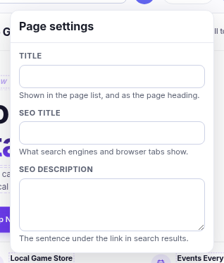
| Field | What it's for |
|---|---|
| Title | Shown in the page list, and used as the page's heading. |
| SEO title | What search engines and the browser tab show. Leave blank to use the title. |
| SEO description | The sentence under your link in search results. Worth writing for anything you want found. |
| Show this page on the storefront | Off takes the page down without deleting it. On a category page, off means that category shows its normal product grid instead — the page is the thing in front of the grid, so removing it puts the grid back. |
Delete this page is here too, and it asks first.