Click a section and its toolbar appears. Everything you can do to that section is on it, and what appears depends on the type — a divider has almost nothing, a cards block has colours and icons.
The breadcrumb
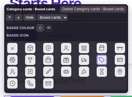
Top left, naming what you have selected — "Category cards · Boxed cards" is the type and then the variant. Where a section has rows inside it, the breadcrumb grows ("Hero · Slide 2 · Badge") and each part is clickable, so you can step back out to the section from a badge three levels down.
The buttons
| Control | What it does |
|---|---|
| ↑ ↓ | Move the section past the one above or below. The arrows point the way the thing actually moves — inside a row of cards or a hero's slides they become ← and →, because those move sideways. |
| Hide | Keeps the section but takes it off the storefront. It stays in the editor marked Hidden. This is how you park a Christmas banner in January. |
| Delete … | Names what it will delete — "Delete Category cards · Boxed cards" — because a mis-click here with a generic label is how people lose a section they meant to keep. It asks first. |
| The variant drop-down | The same content in a different shape. Cards can be boxed cards, a grid, a stack or a strip; an image can sit left, right or full width; an FAQ can be click-to-expand or all open. Change it and the preview redraws instantly — it's the cheapest experiment on the page. |
Colour swatches
Where a section has styleable text you get a row of swatches per line — heading, body, buttons, background. Pick a theme colour wherever you can: those are named roles, so they stay correct if you switch theme later. The last swatch is the ⊘ "use the theme's colour" option, which is how you undo a colour. A custom hex is available as an escape hatch, but it's frozen — a hex chosen against a light theme will still be that hex on a dark one.
The icon grid
Sections with icons — cards, and a hero's trust badges — show the whole set inline: a cube, shield, people, shop front, calendar, table, D20, trophy, box, gift, delivery van, tag, card, trade, loyalty, paintbrush, fanned cards, pizza slice, hourglass, location pin, clock, phone and email. The first tile is no icon.
They're line icons that take their colour from the section, so they always match your theme. You can upload a picture instead, which wins over the icon. You can't paste in your own SVG, deliberately — an icon field that accepted markup would be a security hole.
Settings that only some sections have
| Setting | On | What it does |
|---|---|---|
| Content | Cards | Where the rows come from: Written by me, Shop categories, Latest posts or Recent reviews. Pick a source and the tiles fill themselves and stay current. |
| How many | Cards, Products | How many rows a sourced set is cut to, 1–24. Ignored when you write the tiles yourself — the number you typed is the number you meant. |
| Category | Products | Which category the grid draws from. Left alone on a category page, it uses that page's own category. |
| Show | Event cards | On today, Next 7 days or Next 30 days. Today is the default — if your events block looks empty, this is why: nothing is on today. Widen it. |
| Text position | Hero slides | Left, centre or right, per slide — so a slide can put its words where its picture isn't. |
| Button links | Hero, cards, gallery, quote | Click the button or tile itself and its address is offered beside its colours, rather than hidden in a toolbar box. |